
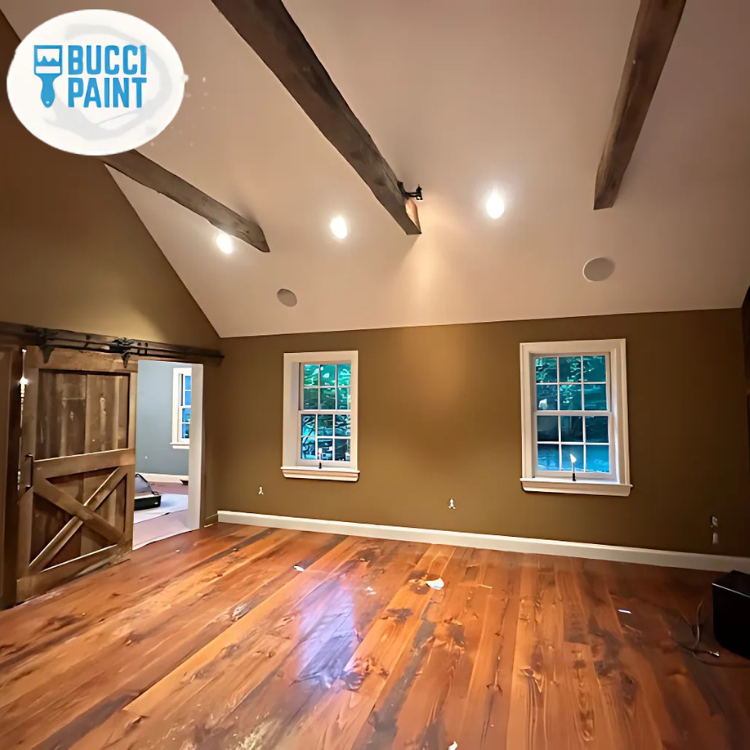
Interior Painting That Makes Rooms Feel Larger
If your Burlington County, NJ home feels darker or more crowded than you remember, it’s often not the layout. Paint color, sheen, trim contrast, and prep decisions can change how light moves through a room. This guide explains the practical choices that help rooms look bigger, plus what to avoid so you don’t end up with flat, blotchy, or “boxy” results.
You finally moved the furniture around, added a lamp, and opened the curtains, but the living room still feels tighter than it should. In Burlington County, NJ, homes can also sit under long winter shadows, and darker wall tones can make that feel even more noticeable.
Before you repaint, it helps to understand which interior painting choices actually affect perceived size. This guide walks you through color direction, trim and ceiling strategy, sheen selection, and prep priorities, so you can plan your project with confidence.
Quick Answer
If you want a room to feel larger, start with a light, warm-neutral wall color and keep the ceiling slightly lighter than the walls. Use consistent sheen (often an eggshell or satin on walls) to avoid harsh reflections, and reduce visual “breaks” by matching trim and wall undertones instead of using high-contrast white everywhere. For best results, address wall imperfections before you paint, because bumps and patch marks read more clearly under brighter, more even lighting. If you’re unsure, ask Bucci Paint about a room-by-room approach tailored to your Burlington County, NJ space.
What to Check First
Before you pick a swatch, look at what the room is already doing to your eyes. A “bigger” finish is usually the result of fewer distractions and more even light reflection.
- Natural light and window placement: Note which walls get light at morning vs. afternoon. Rooms with limited daylight can go dull fast if the undertone is too gray or too cool.
- Current wall condition: Peeling paint, hairline cracks, water stains, or patched drywall will affect how paint lays and how “open” the space feels.
- Trim, doors, and openings: If your trim is significantly darker or significantly brighter than the walls, the room can look segmented.
- Ceiling height and ceiling color: A ceiling that matches the wall too closely can make the top feel lower.
Professional observation: In many Burlington County, NJ homes, the “room feels smaller” problem is actually a combination of undertone mismatch and inconsistent sheen. When walls and trim don’t share the same visual temperature, the eye keeps recalibrating, and the space feels chopped up.
Main Things Customers Should Understand
Here are the interior painting decisions that most often change how spacious a room feels. Use them as a planning framework, not a rigid rule.
1) Choose the right light color
Look for light neutrals with undertones that match your floors and cabinetry. A “white” that reads yellow in one room may read gray in another, especially under the mix of natural light and warm indoor lighting common in NJ homes.
2) Control contrast
High contrast between walls and trim can emphasize edges and corners. To make rooms feel larger, reduce contrast where you can, or use a subtle shift rather than a stark difference.
3) Pick sheen intentionally
Too glossy can spotlight imperfections. Too flat can absorb light and look heavy. Many homeowners like an eggshell for walls and a ceiling-appropriate finish to keep the top bright without looking shiny.
Ceiling and trim strategy that visually “opens” space
If you want the room to feel taller and wider, treat the ceiling like part of the lighting plan. A ceiling that’s slightly lighter than the walls helps the eye travel upward. For trim and doors, focus on consistency: matching undertones helps the room feel more continuous.
Prep work: the unglamorous part that changes everything
Bright paint makes a room feel bigger, but it also makes flaws more visible. That’s why prep matters so much. Common prep tasks that support a clean, open look include:
- Scraping and priming areas where paint has failed or stains bleed through
- Filling and smoothing nail holes and patch seams
- Addressing drywall issues so paint does not highlight ridges
| Goal | What to do with paint | What to avoid |
|---|---|---|
| Make walls feel brighter | Use a light neutral wall color and test it in your room’s actual lighting. | Choosing a “white” that fights your floors or creates a gray cast. |
| Make ceilings feel higher | Paint ceilings a touch lighter than walls and keep the finish appropriate for ceilings. | Matching the ceiling too closely to the wall color. |
| Reduce a “boxed-in” look | Smooth transitions between wall and trim by using compatible undertones and controlled contrast. | Using extreme contrast on every edge, which can outline the room. |
| Keep imperfections from showing | Use sheen that supports a smooth visual finish and plan for adequate prep. | Going too glossy, which can reveal patchwork and uneven surfaces. |
Quick planning tip: If you’re also updating carpentry details (trim, doors, or cabinetry), do that work before interior painting so the paint line looks intentional and continuous.
Why This Matters in Burlington County, NJ
Burlington County, NJ homes often include older finishes and seasonal lighting shifts. In winter, daylight can feel limited, and cooler overcast conditions can make certain undertones appear darker than expected. A room that “looked fine” during a bright afternoon can look heavy at night if the color undertone is off or if sheen is mismatched between walls and trim.
Bucci Paint approaches interior painting with the lighting you actually live with. That includes prepping properly so the brighter color looks even, and selecting wall and trim relationships that keep the space feeling open through the year.
Common Mistakes to Avoid
These are the issues that most often cause a room to look smaller after painting, even when the color seems right at first.
- Skipping patch smoothing: Brighter colors can reveal seams and uneven texture, which adds visual clutter.
- Choosing a wall “white” without undertone checks: If it clashes with flooring, cabinetry, or lighting, the room can look dull or gray.
- Using high contrast everywhere: Too much difference between wall and trim can outline the room more than you want.
- Picking sheen without thinking about imperfections: Glossier finishes often highlight uneven areas; flatter finishes can absorb light.
- Painting before repairs: If drywall needs attention, the paint won’t fix the underlying issue. Consider drywall install and repair before final coats.
Helpful next step
If your walls have chips, cracks, or visible patchwork, you may want to review drywall install and repair in New Jersey before choosing the final paint system.
Edge detail matters
For homeowners planning trim refreshes, doors, or other carpentry-related updates, explore molding, trim and flooring installation in New Jersey to keep transitions crisp.
Matching the whole property
If you’re painting multiple areas, it can help to plan continuity across spaces. Bucci Paint also supports interior painting in New Jersey with a room-by-room approach.
Customer Checklist
- Walk the room at different times (morning and evening) and note which walls get the most light.
- Test paint samples on the actual wall surface, not just on a card, and observe them under indoor lighting.
- Decide how you want the ceiling to relate to the walls (usually slightly lighter for a more open feel).
- Choose a consistent trim and door approach so edges do not look overly segmented.
- Confirm prep needs: patching, smoothing, and priming for stains or repairs.
- Pick a sheen that balances light reflection with surface smoothness.
- Plan the order of work if you’re also updating carpentry details or cabinetry.
Representative Scenario (Anonymized)
A homeowner in Burlington County, NJ was preparing their dining and living rooms for more entertaining. The space looked smaller than it did in photos, especially during winter evenings. The walls had multiple patch areas from previous repairs, and the trim was painted in a noticeably different undertone than the wall color.
Bucci Paint focused on smoothing and priming first, then selected a light wall neutral that worked with the room’s flooring and lighting. The ceiling was set slightly lighter, and the trim approach was tuned to reduce harsh edge contrast. The result was a brighter, more open look that read “bigger” without changing the layout.
Ready to make your rooms feel larger?
Share a few details about your Burlington County, NJ space and what feels “off” right now. Bucci Paint can help you plan a practical interior painting direction, including color and prep priorities.
Call Bucci Paint at (609) 462-5017Frequently Asked Questions
What wall color usually makes a room feel bigger?
In most homes, light neutrals help the most. The key is not just “light” but the undertone. A light color can still feel heavy if it clashes with your floors, cabinetry, or lighting. If your room has limited daylight, consider testing samples directly on your wall and observing them at night, not only in bright daytime. Pairing a slightly lighter ceiling with walls can also improve the “openness” you feel when you walk into the room.
Should trim and doors match the walls, or should they contrast?
For a larger-feeling room, many homeowners benefit from reduced contrast. That doesn’t always mean identical color, but it does mean coordinating undertones so the visual edges are less abrupt. If trim is dramatically different from the walls, the room can look more segmented, especially in smaller spaces or rooms with lots of openings. A consistent approach to trim and door finishes helps the eye move through the room smoothly.
What sheen should I use for walls and ceilings?
Sheen affects both light and how imperfections show. Generally, wall finishes that aren’t too glossy help reduce the “spotlight” effect on patch seams and uneven areas. Ceiling finishes are often selected to keep the top bright without looking shiny. The best choice depends on your wall condition and the amount of natural light. If you have visible texture or patchwork, sheen selection becomes even more important.
Do I need drywall repair before interior painting?
If you have cracks, bubbling, loose edges, or visible patch seams, drywall repair and prep should come before final paint. Paint can improve appearance, but it cannot permanently fix underlying problems like failing drywall tape or moisture-related issues. Repairing and smoothing surfaces first helps your new interior painting look even and clean, which is especially important when you choose lighter wall colors that can highlight flaws.
Can interior painting help a room feel larger without changing furniture?
Yes. You can often make a noticeable difference by changing how light is reflected and how strong the visual edges are. Light wall colors, a slightly lighter ceiling, coordinated undertones on trim, and the right sheen can all reduce the “boxy” feeling. Even small updates, like smoothing patchwork and evening out sheen, can make the room feel more cohesive and open.
Get a room-by-room plan from Bucci Paint
If you want interior painting that supports a larger, brighter feel, the details matter: prep, color direction, sheen, and trim relationships. Contact Bucci Paint to talk through your Burlington County, NJ project.
Contact Bucci Paint