Interior Painting Color Trends That Feel Effortless
On any given weekend in Evesham, you’ll find at least a few homeowners standing in the paint aisle, holding a handful of color chips and looking overwhelmed. With hundreds of whites, grays, and “greiges” to choose from, it’s easy to second-guess every decision—especially when you’re investing in a full interior repaint.
National design surveys show more than 70% of homeowners regret at least one major color choice in their home. At the same time, interior color is one of the simplest upgrades that can increase perceived home value and day-to-day comfort. In a competitive South Jersey real estate market where well-styled homes sell faster and for more, your color choices matter.
This guide breaks down the interior painting color trends that feel effortless—timeless enough to last, but modern enough to feel fresh. You’ll see how these trends play out in real New Jersey homes, how to avoid common mistakes, and how to use professional Interior painting to get a finish that looks as good as the color you choose.
Key Insight: The most successful color trends aren’t flashy—they’re flexible. The right palette works with your light, your furnishings, and your lifestyle, so your home looks “pulled together” without trying too hard.
Soft Neutrals That Don’t Feel Boring
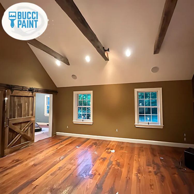
For years, gray dominated interior design. In Evesham and across South Jersey, we’re seeing a shift toward warmer, softer neutrals that feel inviting instead of cold. Think creamy off-whites, warm greiges, and putty beiges with subtle depth.
These colors are ideal for:
- Open-concept living and dining rooms
- Hallways and stairwells
- Homes with mixed furniture styles
A family in Kings Grant recently asked us to repaint their first floor, which had a cool blue-gray that made their oak floors look orange. We shifted to a warm greige with a hint of taupe. The transformation was immediate: the floors looked richer, their white trim popped, and the entire space felt more cohesive. The color didn’t “steal the show,” but it made everything else look better.
“Neutrals should be supporting actors, not the star of the room.” — Senior Color Consultant, Bucci Paint
When paired with crisp white trim and smooth walls (often after minor Drywall Install and Repair), these soft neutrals create an effortless backdrop. They also make it easier to update your style over time with new textiles and decor instead of repainting every few years.
As we move into more layered, textural interiors—rattan, natural woods, boucle fabrics—these gentle neutrals let the materials shine without making the room feel flat.
Earthy Greens and Blues That Calm, Not Clash
Earth tones are back, but not in the heavy, dark way you might remember from the early 2000s. Today’s versions are muted, slightly grayed-down greens and blues that feel restful and refined.
In South Jersey homes, we’re seeing these colors most often in:
- Bedrooms and guest rooms
- Home offices
- Powder rooms and accent walls
A recent project in an Evesham colonial involved transforming a stark white home office into a productive, calming space. The homeowner worked remotely and spent 8–10 hours a day in that room. We selected a soft blue-green with a gray undertone. Paired with bright white trim and a natural wood desk, the room instantly felt like a boutique workspace rather than a spare bedroom.
“Cool colors with a touch of gray are ideal for focus spaces. They calm the eye without feeling cold.” — Lead Designer, Bucci Paint
Because these hues are subtle, they work beautifully with existing finishes. We’ve used muted sage on kitchen walls to complement stained wood cabinets, and soft blue-gray in bathrooms with existing tile. If you’re updating cabinetry as part of a larger remodel, pairing new Trim and Door Installation with these tones can make the whole space feel custom.
For homeowners thinking ahead to resale, these colors also photograph well for listings—an underrated but important detail in today’s market.
Warm Whites and Layered Whites: The New Classic
Pure, bright white still has its place, but most South Jersey homes look better in slightly warmed-up whites. The trick is finding the right undertone for your space.
In many Evesham neighborhoods, homes feature:
- Medium to dark hardwood floors
- Off-white or cream kitchen cabinets
- Natural stone or warmer-toned counters
A stark, cool white on the walls can fight against these finishes. Instead, we often recommend a soft white with a touch of warmth for the walls, paired with a cleaner white for trim, doors, and ceilings. This layered white approach adds depth without introducing a lot of color.
We recently completed a full first-floor repaint in a Marlton townhouse. The homeowners had updated their floors to a light oak and added new white shaker cabinets. Their existing beige walls felt dated next to the modern finishes. Rather than jumping to a gallery-white look, we chose a warm white for the walls and a brighter white for trim and doors. The result was modern, airy, and still inviting—no hospital vibes.
Layered whites also work brilliantly in older homes where you might be combining updated elements with existing ones. With the right prep and Residential Interior Painting, even dated trim can look sharp when coated in a fresh, durable enamel.
For many clients, this palette feels the most “effortless” of all. It gives you a clean slate for art, textiles, and seasonal decor while maintaining a polished, finished look year-round.
Strategic Accent Colors That Feel Intentional, Not Trendy
Accent walls and bold colors are still very much in play—but the approach has evolved. Instead of random bright feature walls, the most successful schemes use color purposefully to define spaces and highlight architecture.
In Evesham and surrounding towns, open-concept layouts are common. Accent color can:
- Visually separate dining and living zones
- Draw attention to a fireplace or built-in
- Add personality to a small powder room or mudroom
A great example: a family in Evesham wanted their basement to feel like a true extension of their main living space, not an afterthought. We kept most of the walls in a warm neutral but painted the wall behind their built-in media center in a deep, inky blue. It grounded the space, made the TV wall feel intentional, and tied in with navy accents upstairs.
“Accent colors should support the flow of your home, not fight it. Repeat them in textiles and decor for a cohesive look.” — Project Manager, Bucci Paint
Accent colors can also coordinate with exterior choices. If you’re planning Exterior Painting or updating your front door, echoing that color inside (on a mudroom bench, interior door, or accent wall) creates a subtle, high-end design continuity.
The key is restraint. One or two well-chosen accent areas usually look more sophisticated than multiple bold walls scattered throughout the home.
Color Pairings That Work in Real South Jersey Homes
Not all color combinations that look good online translate well to real homes—especially in a region with four distinct seasons and varied natural light. Below are pairings we see working repeatedly in Evesham and nearby communities.
Popular Pairings
- Warm white + greige
Ideal for: First-floor living areas, open-concept spaces
Why it works: Soft contrast keeps things light but not stark.
- Soft green + warm white trim
Ideal for: Bedrooms, home offices, bathrooms
Why it works: Feels calm and natural, pairs well with both wood and painted furniture.
- Deep navy/ink + neutral walls
Ideal for: Dining rooms, media rooms, feature walls
Why it works: Adds drama while keeping the main palette flexible.
- Clay/terracotta accents + creamy neutrals
Ideal for: Powder rooms, entryways, small niches
Why it works: Warm, welcoming, and on-trend without feeling loud.
Here’s how a “traditional” vs. “modern effortless” approach might look in the same Evesham colonial:
| Approach | Wall Color Scheme | Trim & Doors | Overall Effect in South Jersey Light |
|---|---|---|---|
| Traditional (early 2000s) | Yellow beige throughout | Cream trim, matching doors | Can feel dated, muddy, and heavy in winter light |
| Modern Effortless | Warm white + greige accents | Crisp white trim, updated door color | Brighter, more spacious, easier to decorate around |
These pairings are flexible enough to handle seasonal decor shifts—from fall pumpkins on the porch to bright summer textiles—without your home ever feeling off-balance.
Coordinating Interior Colors With Exterior and Architectural Details
Your interior shouldn’t feel like a completely different world from your exterior. Thoughtful coordination between inside and out creates a sense of flow that feels naturally “put together.”
In Evesham, many homes feature:
- Vinyl or fiber cement siding in grays, tans, or blues
- Brick or stone accents
- Decks and outdoor living spaces
When homeowners schedule Exterior Painting or Masonry, Concrete, and Stucco Coatings, we often discuss interior colors at the same time. For example, if the exterior trim is a soft white and the front door is a deep green, bringing that same green into the foyer—on a console table, interior door, or accent wall—makes the transition seamless.
A recent project in Evesham involved repainting an aging deck and refreshing interior spaces visible from the backyard. We stained the deck in a rich, neutral tone, then selected interior neutrals with a similar warmth. The homeowners loved how the view from the kitchen looked out onto a deck that felt like a natural extension of their color palette.
“Think of your home as one continuous experience—from curb to kitchen. Color is the thread that ties it together.” — Owner, Bucci Paint
This holistic approach is especially important for homes with open views between front entry, main living spaces, and back patios. Coordinated colors make the entire property feel more cohesive and higher-end—without adding any effort to your daily life.
What This Means for Homes in Evesham, NJ
Evesham sits at an interesting crossroads: close enough to Philadelphia to feel urban-adjacent, but with a strong suburban character and a wide range of home ages and styles. That variety means there’s no single “right” color scheme—but it also means trendy choices can date quickly if they don’t respect the architecture and light.
Local factors that influence effortless interior color choices include:
- Four distinct seasons
Your colors need to look good against bright summer greens and muted winter skies. Overly cool grays can feel harsh in January; overly warm beiges can feel heavy in August.
- Mixed architectural styles
From 1970s colonials to newer townhomes, the right palette should align with your home’s bones. A sleek, ultra-modern scheme can look out of place in a traditional neighborhood.
- Active resale market
Even if you’re not planning to move soon, neutral, cohesive interiors give you flexibility and can make your home stand out when you do list.
Effortless color trends in Evesham aren’t about chasing the latest social media look. They’re about creating a backdrop that works with your lifestyle, your furnishings, and the natural light your home actually gets.
Professional Interior painting also plays a huge role. Precise cut lines, properly prepared walls, and well-finished trim can make even simple colors look elevated. Combined with thoughtful color choices, your home can feel refreshed, current, and uniquely yours—without constant repainting.
Frequently Asked Questions
Q: How do I choose interior colors that won’t feel dated in a few years?
A: Focus on timeless, flexible neutrals for your main spaces, and add personality in smaller doses. In Evesham, we recommend warm whites, greiges, and soft earth tones as a base. These work with most flooring and finishes, and they’re easy to pair with bolder accent colors in pillows, art, or one or two feature walls. Working with a professional Residential Interior Painting team also helps—you get guidance on undertones, light, and how colors will age over time, not just how they look on a swatch today.
Q: Will new wall colors clash with my existing cabinets, counters, or floors?
A: They don’t have to—and they shouldn’t. The key is starting with your fixed elements: flooring, countertops, tile, and large furniture pieces. In South Jersey homes, we often see warm wood floors and mixed-tone granite. We bring paint samples directly into your space, compare them against these finishes, and adjust undertones accordingly. Sometimes a subtle shift—like moving from a cool white to a warm white—can make your existing materials look newer and more intentional, without major remodeling.
Q: How does natural light in Evesham affect interior color choices?
A: Our region’s changing seasons and varied exposures can dramatically alter how colors read. North-facing rooms tend to look cooler and benefit from warmer neutrals. South-facing rooms can handle slightly cooler tones because they receive more consistent light. Overcast winter days can make colors look dull if they’re too gray. That’s why we always recommend testing paint in several spots and viewing it morning, midday, and evening. A professional Interior painting consultation takes this into account before any paint goes on the walls.
Q: Can I update trim, doors, and walls at different times, or should it all be done together?
A: You can absolutely phase projects, especially if you’re living in the home during work. Many Evesham homeowners start with walls, then tackle Trim and Door Installation or repainting trim later. The important part is having an overall color plan from the start—so your future trim color coordinates with your current wall color. A good painting contractor will help you map out a sequence that fits your budget and schedule while still moving toward a cohesive, finished look.
Q: How do interior color choices relate to my exterior and deck colors?
A: More than most people think. If you have large windows, glass doors, or an open view to your deck or patio, those exterior colors become part of your interior palette. When we handle Exterior painting or Deck Staining, we often coordinate with interior colors so everything feels connected. For example, a warm-toned deck stain can echo the warmth in your interior floors, while a bold front door color can be repeated in a foyer accent or powder room for a subtle, designer-level detail.
Q: I’m planning a larger remodel. When should I decide on paint colors?
A: Choose paint colors toward the end of your planning process, after you’ve selected major finishes like flooring, tile, cabinets, and counters. If you’re working with a contractor on Carpentry Services or Custom Cabinetry, we coordinate closely to ensure paint supports those choices. Paint is relatively easy to adjust; countertops and flooring are not. By finalizing colors once the big elements are in place (or at least chosen), you ensure an effortless, harmonious result.
Q: Do I really need a professional painter, or can I DIY these trends?
A: You can DIY, but the more “effortless” the look you want, the more details matter. Trend-forward palettes often rely on clean lines between walls and trim, smooth drywall, and consistent sheen. Professional teams handle surface prep, Drywall Install and Repair, and precise cutting so your colors look intentional and refined. In Evesham’s busy households, hiring pros also means less disruption and a faster turnaround—your home is back to normal sooner, and you get a finish that holds up to daily life.
Ready to Get Started?
Color trends come and go, but a well-planned palette can make your home feel comfortable, current, and uniquely yours for years. In Evesham, where homes range from classic colonials to newer developments, a thoughtful approach matters even more—your colors need to work with your architecture, your light, and your lifestyle.
Right now is an ideal time to plan interior updates, especially if you want your home feeling fresh for the next season, upcoming holidays, or a potential sale. Our schedule in South Jersey fills quickly during peak painting months, so booking early gives you more flexibility on timing.
The next step is simple: schedule a consultation. We’ll walk through your home, look at your existing finishes, discuss how you use each room, and recommend an effortless color plan tailored to you. From there, our team handles everything—from prep to final walkthrough—so all you notice is how good your home feels.
About Bucci Paint
Bucci Paint is a locally owned painting and remodeling company based in Evesham, NJ, serving homeowners and businesses throughout South Jersey. For years, our team has specialized in high-quality Interior painting, Exterior painting, and integrated services like Trim and Door Installation and Drywall Install and Repair. We combine careful craftsmanship with design-focused guidance to create spaces that look polished and feel effortless, project after project.