
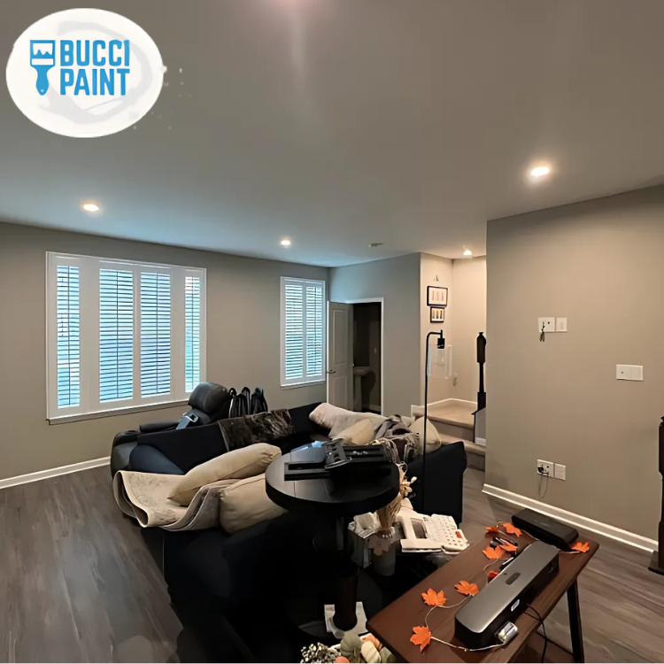
Interior Painting: Warm Neutrals for Modern Living
Walk into almost any newly renovated home in Evesham or nearby South Jersey communities and you’ll notice a common thread: soft, warm neutral walls that feel inviting, calm, and current. There’s a reason for that. A recent national survey found that 58% of homeowners planning a refresh chose warm neutrals for their main living areas, and local realtors in Burlington County consistently report that neutral interiors help homes sell faster and for more money.
In a region where many homes blend traditional layouts with modern updates, color has to work a little harder. It needs to flatter existing finishes, make the most of natural light, and stay timeless enough that you won’t be repainting every two years. That’s where a thoughtful interior painting plan built around warm neutrals becomes a real design asset, not just a coat of paint.
This guide explores how warm neutrals can modernize your home, how to choose the right shades for different spaces, and how professional painters like Bucci Paint approach prep, application, and coordination with other trades to get a truly polished result.
Key Insight: The right warm neutral palette doesn’t just look good—it connects your rooms, improves resale appeal, and makes everyday living in your Evesham home feel more comfortable and cohesive.
Why Warm Neutrals Are the New Modern Classic
Warm neutrals—think soft beiges, greiges, creamy whites, and gentle taupes—have become the go‑to backdrop for modern living spaces. They offer a clean, updated look without the starkness of cool grays that dominated the last decade.
In South Jersey, where many homes feature medium-toned wood floors, brick fireplaces, and traditional trim profiles, warm neutrals bridge the gap between classic architecture and contemporary styling. Instead of fighting against fixed elements like oak cabinetry or stonework, these hues complement them.
A few reasons they work so well:
- They soften strong natural light in sun-filled rooms.
- They warm up north-facing spaces that can feel cold or shadowed.
- They pair beautifully with both modern and traditional furniture.
- They’re forgiving of everyday wear and minor imperfections.
We recently completed a full Interior painting project in a 1990s Evesham colonial. The homeowners wanted a more modern look without a full renovation. By shifting from yellow-toned beige to a soft, warm greige throughout the first floor, the space instantly felt updated. Their darker cherry furniture suddenly looked intentional rather than dated, and the white trim popped in a crisp, fresh way.
“Color is the quiet backdrop that either supports your design—or fights it every day.” — Bucci Paint Design Team
As we layer in more detail, you’ll see how these subtle tones can transform everything from open-concept living areas to small bedrooms without overwhelming your home’s character.
Building a Cohesive Warm Neutral Palette for Your Home
A modern interior doesn’t mean every room has the exact same color, but it does mean your colors relate to each other. A well-designed warm neutral palette feels intentional as you move from one space to another.
In Evesham and the surrounding towns, many homes have semi-open floor plans: a connected kitchen, dining area, and family room, with hallways leading to more private spaces. A smart palette typically includes:
- A main “whole house” color for hallways, open areas, and shared spaces.
- 1–2 supporting neutrals that are slightly lighter or darker.
- 1–2 accent colors for feature walls, powder rooms, or offices.
For a recent residential interior painting project near Marlton, we used a soft oatmeal tone in the main living areas, a lighter creamy white in the hallway and stairwell, and a deeper greige accent in the dining room. The result was subtle but powerful: the rooms felt defined yet connected, and the homeowners didn’t feel “boxed in” by strong colors.
A professional Residential Interior Painting team can also help you consider:
- Existing finishes (flooring, countertops, tile, stone)
- Ceiling height and natural light direction
- How often doors between rooms are open or closed
- Whether you plan future renovations, like new cabinets or trim
“Think of your color palette as a map. Every room doesn’t have to look the same, but every route through your home should feel smooth and intuitive.” — Bucci Paint Project Consultant
A cohesive palette also pays off if you eventually decide to repaint your home’s exterior or add custom built-ins—your interior and exterior can be planned to complement each other over time.
Light, Architecture, and How Warm Neutrals Really Look in Evesham Homes
Paint chips rarely tell the full story. The same “perfect” neutral that looks great in a showroom can read very differently in a South Jersey home with mature trees, deep overhangs, or limited natural light.
Local conditions matter:
- Seasonal light shifts: Winters in Evesham bring cooler, lower light that can make cool grays feel flat and chilly. Warm neutrals counterbalance that.
- Mature neighborhoods: Many homes have front-facing rooms shaded by trees, which can make colors appear darker.
- Mixed artificial lighting: Older fixtures may have warm bulbs, while newer recessed lighting skews cooler.
On a recent job near Kings Grant, a homeowner initially chose a light beige from an online inspiration photo. Once we put it on the wall, it looked almost pink in their north-facing living room. By adjusting to a slightly more muted, taupe-leaning neutral, we avoided unwanted undertones and delivered the calm, modern look they wanted.
To avoid surprises, we often:
- Apply large test swatches on multiple walls.
- View them during morning, afternoon, and evening.
- Check against trim, flooring, and furniture.
For homes undergoing broader updates, we coordinate with other services like Carpentry Services and custom built-ins to ensure the paint color highlights, rather than hides, the craftsmanship.
“Color isn’t chosen in a vacuum. It lives with your light, your finishes, and your daily routines.” — Lead Estimator, Bucci Paint
Warm neutrals give you more flexibility in these real-world conditions, especially in a climate and housing stock like Evesham’s.
Prep, Surfaces, and Why Quality Matters More with Neutrals
Warm neutrals are beautiful—but they’re also honest. Because they’re subtle and light-reflective, they tend to reveal surface imperfections more than dark or highly saturated colors.
That makes proper preparation critical:
- Repairing nail pops, cracks, and dings
- Skim-coating rough or patched areas
- Sanding glossy surfaces for adhesion
- Priming stains or water marks
In an older Evesham townhouse, a client wanted to shift from bold accent walls to a soft, creamy neutral throughout. Once the bright colors were covered, every drywall seam and previous patch became obvious. Our team performed additional Drywall installation and repair work, feathered edges, and used a high-quality primer before applying the final coats. The difference between “good enough” and “polished” was immediately noticeable.
“Neutrals don’t hide shortcuts. If the prep isn’t right, the walls will show it every single day.” — Bucci Paint Crew Lead
Here’s how a professional approach compares with a basic DIY or low-bid job:
| Aspect | Traditional Low-Bid Approach | Professional Modern Approach (Bucci Paint) |
|---|---|---|
| Wall Prep | Spot patch only obvious holes | Full assessment, repair, and skim as needed |
| Primer Use | Often skipped to save time | Targeted or full priming based on surface |
| Sheen Selection | Same sheen everywhere | Tailored sheen by room and traffic level |
| Product Quality | Budget paints | Premium paints for durability and coverage |
| Long-Term Appearance | Touch-ups and flashing likely | Even finish that ages gracefully |
Investing in proper prep and application ensures your warm neutral palette looks refined, not unfinished—and that it stays that way for years.
Connecting Interior Warmth with Exterior Curb Appeal
Modern living doesn’t stop at the front door. Many South Jersey homeowners are updating both their interiors and exteriors together, so the home feels cohesive from the street to the back patio.
If you’re refreshing your interior with warm neutrals, it’s a great time to think about how your exterior colors relate:
- A warm off-white or taupe interior pairs nicely with earthy, neutral exterior shades.
- Black or deep bronze window frames look striking against both light interior and exterior walls.
- Warm wood tones on doors and decks echo the softness of interior palettes.
We recently worked on a home near Evesham’s Blue Barn area where the owners chose a warm greige inside and a slightly deeper, complementary greige for the exterior siding. Their front door in a rich wood stain created a beautiful transition between indoors and out. The updated Exterior painting made the home look freshly modern without clashing with neighboring houses.
For outdoor living spaces, coordinated Deck Staining or Deck Painting can extend your warm neutral palette to:
- Railings and spindles
- Pergolas or porch ceilings
- Concrete or masonry coatings around patios
“Your home should feel like one continuous story—from curb to kitchen to backyard.” — Bucci Paint Color Consultant
A thoughtful color strategy that includes both interior and exterior surfaces creates a sense of harmony that’s hard to achieve with piecemeal updates.
Pairing Warm Neutrals with Trim, Doors, and Custom Details
Warm neutral walls set the stage, but the supporting players—trim, doors, cabinetry, and built-ins—determine whether your home feels builder-basic or custom and curated.
In many Evesham homes, original trim is either natural wood or older off-white that has yellowed over time. Updating these elements while refreshing wall colors can completely change how a space feels.
Common strategies we use:
- Crisp white trim + warm walls: Creates a clean, modern contrast that still feels inviting.
- Soft white trim + creamy walls: Offers a quieter, more traditional look with subtle depth.
- Stained wood + greige walls: Keeps character while toning down visual heaviness.
On a recent project in a 1980s split-level, we combined new Trim and Door Installation with warm neutral walls and custom painted built-ins. The homeowners had considered full Custom Cabinetry, but by painting their existing units a soft white and using a gentle greige on the walls, we delivered a high-end look at a fraction of the cost.
“Details like trim profiles, door styles, and built-in finishes are what separate a ‘nicely painted house’ from a truly modern, custom-feeling home.” — Bucci Paint Finish Specialist
By aligning your wall colors with upgrades to trim, doors, and cabinetry, you create a layered, intentional design that makes everyday living feel more refined—without needing a full-scale renovation.
What This Means for Homeowners in Evesham, NJ
Evesham and the surrounding South Jersey communities have a diverse housing stock: classic colonials, townhomes, split-levels, and newer developments. Many of these homes were built or renovated during the height of builder beige or cool gray trends, and now owners are looking for something that feels both current and enduring.
Warm neutrals are a smart response to that local reality.
- They work with the brick, stone, and siding colors common in our neighborhoods.
- They flatter the medium-toned hardwoods and cabinetry installed in many 1990s and 2000s homes.
- They make smaller, compartmentalized floor plans feel more continuous and open.
- They balance the strong seasonal light changes we experience in New Jersey.
Local real estate agents often advise sellers in Evesham to neutralize strong wall colors before listing. A well-executed warm neutral palette not only checks that box but can also photograph beautifully for online listings, where most buyers now form their first impressions.
From a budget standpoint, repainting with warm neutrals is one of the highest-ROI improvements you can make before bigger investments like kitchen remodels or new flooring. And when coordinated with services like Interior painting, trim upgrades, and even selective Carpentry Services, you can effectively “re-age” your home by a decade or more in how it looks and feels.
Warm neutrals aren’t a trend that will feel dated in a few years. They’re a foundation—one that supports your style now and gives you room to evolve your furnishings, art, and decor over time, all while keeping your Evesham home feeling modern, welcoming, and market-ready.
Frequently Asked Questions
Q: How do I choose the right warm neutral for my specific Evesham home?
A: Start with your fixed elements: flooring, countertops, tile, and large furniture pieces you plan to keep. In many South Jersey homes, these lean warm—oak, cherry, beige or tan tile—so a warm neutral with similar undertones will harmonize best. Next, consider your light: south-facing rooms can handle richer, deeper neutrals, while shaded or north-facing rooms often benefit from lighter, creamier tones. A professional Interior painting consultation typically includes on-site color sampling so you can see how options behave with your actual light and finishes, rather than relying on online photos or small chips.
Q: Will warm neutrals make my smaller rooms feel darker or smaller?
A: Not if they’re chosen thoughtfully. Warm neutrals with a light to medium-light value can actually make small rooms feel more open and cozy at the same time. The key is avoiding colors that are too saturated or too muddy. In compact bedrooms or hallways, we often recommend a soft, warm off-white or very light greige with a bit of depth, paired with a crisp white ceiling and trim. The contrast draws the eye upward and keeps the room from feeling cramped. Proper surface prep and the right sheen also help reflect light evenly, which is where professional Residential Interior Painting really pays off.
Q: How do warm neutral interiors coordinate with my existing exterior color?
A: Many Evesham homes feature neutral exteriors—tan siding, brick, or earth-toned stucco. Warm neutrals inside typically complement these existing colors very well. If your exterior is cooler (like blue-gray siding), we’ll look for interior neutrals that bridge the gap, often with a balanced greige that has both warm and cool elements. During a color consultation, we can also discuss future Exterior painting plans so your long-term palette feels cohesive. Even if you’re not ready to repaint outside now, planning ahead ensures your interior choices won’t limit your options later.
Q: Can I still use accent walls or bold colors with a warm neutral palette?
A: Absolutely. Warm neutrals provide an ideal backdrop for strategic accents. We often recommend using bolder hues in smaller doses: a dining room wall, a home office, or a powder room. These spaces can handle more personality without overwhelming the entire home. The key is choosing accent colors that share undertones with your main neutrals, so transitions feel smooth. Our team can help you plan where accents make sense and how they’ll work with existing elements like fireplaces or built-ins. If you’re upgrading trim or doors through Trim and Door Installation, that’s also a great time to define accent opportunities.
Q: How durable are warm neutral paints in high-traffic areas with kids and pets?
A: Durability has more to do with product quality and sheen than color alone, but warm neutrals do have one advantage: they tend to hide minor scuffs better than very dark or very bright colors. For busy Evesham households, we typically recommend premium, washable paints in matte or eggshell finishes for main living areas and hallways. These finishes maintain a modern, soft look while allowing for easy cleaning. For stairwells, mudrooms, and kids’ spaces, we might step up to a slightly higher sheen. A professional Interior painting team will match products and finishes to how you actually live, not just how the room looks in photos.
Q: Should I update my trim and doors at the same time as repainting my walls?
A: In many cases, yes. Old, yellowed trim or mismatched doors can undermine the fresh look of new wall colors. Updating these elements during a repaint is often more cost-effective than doing them separately, since prep and masking are already in progress. Through our Trim and Door Installation services, we can replace dated profiles, add crown or wainscoting, and paint everything in a cohesive white or soft neutral that complements your walls. The result is a more finished, custom feel that significantly elevates your warm neutral palette.
Q: We’re also planning some light remodeling. How should we coordinate painting with that work?
A: Coordination is crucial. If you’re doing any General Remodeling, new cabinets, or built-ins, those elements should typically be installed and primed before final painting. We often collaborate with carpenters and other trades to sequence work efficiently: drywall and repairs first, rough carpentry, then primer, finish carpentry, and final coats. Planning color early helps ensure that new materials, such as cabinetry or trim, arrive in finishes that align with your warm neutral scheme. This integrated approach minimizes rework and delivers a unified, modern result.
Ready to Get Started?
Warm neutrals are one of the most effective ways to modernize your Evesham home without a full renovation. They bring calm, cohesion, and versatility to your spaces—and when they’re paired with proper prep, quality products, and expert application, they can transform how your home looks and feels for years.
Seasonal timing matters in New Jersey. Spring and fall are especially popular for both interior and Exterior painting, which means schedules fill quickly. If you’re considering a refresh before hosting holidays, listing your home, or tackling outdoor projects like Deck Repainting, starting the conversation early ensures you get your preferred timing.
The next step is simple: schedule a consultation with Bucci Paint. We’ll walk your home, discuss how you live in each space, review color options, and provide a detailed, transparent proposal. From there, our local, fully insured team handles the rest—prep, protection, painting, and clean-up—so you can enjoy a warm, modern home without the stress.
About Bucci Paint
Bucci Paint is a locally owned painting and remodeling company based in Evesham, NJ, serving homeowners and businesses across South Jersey. With years of experience in Interior painting, Exterior painting, carpentry, and finishing services, our team is known for meticulous prep work, clear communication, and results that stand the test of time. Whether you’re refreshing a single room or updating your entire home, we bring professional craftsmanship and a neighborly approach to every project. Learn more at Bucci Paint’s website.