Maximize Your Room’s Potential With Colors
If you’ve ever walked into a room in your Evesham home and thought, “Something feels off, but I can’t put my finger on it,” chances are the color is part of the problem. Color isn’t just decoration—it quietly controls how big your room feels, how calm or energized you are, and even how long guests want to stay.
National surveys show that more than 60% of homeowners regret at least one paint color choice within a year. Yet, repainting is one of the most affordable ways to transform a space, especially compared to structural remodeling. In a place like Evesham, where natural light changes dramatically from season to season, choosing the right color is even more critical.
This guide will walk you through how to use color strategically—whether you’re updating a single bedroom, refreshing your whole home, or rethinking your business interior. You’ll learn how color affects mood and space, how to work with your room’s architecture and light, and how professional Interior painting can help you get it right the first time.
Key Insight: The right color scheme doesn’t just make a room “look nice”—it can make it feel larger, brighter, calmer, or more sophisticated, all without moving a single wall.
How Color Changes the Way Your Room Feels
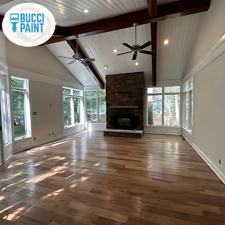
Color is one of the most powerful design tools you have, yet it’s often treated as an afterthought. In reality, color can visually reshape a room—making ceilings feel higher, narrow rooms feel wider, and dark corners appear brighter.
Cool colors (blues, greens, soft grays) tend to recede, making walls feel further away. Warm colors (beiges, taupes, terracottas, soft yellows) advance, creating a cozier feel. That’s why a pale blue bedroom in Evesham with good natural light can feel airy and expansive, while a warm greige living room can feel inviting during those long New Jersey winters.
One Evesham homeowner we worked with had a small family room that felt cramped and dim. The walls were a dark tan, and the ceiling was slightly off-white but yellowed with age. By repainting the walls in a light, cool gray and brightening the ceiling with a crisp white, the room instantly felt a full size larger—without changing a single piece of furniture.
“Color is the least expensive way to dramatically alter the perceived size and mood of a room.” — Design Principle, Bucci Paint
CALLOUT: Think of color as architecture you can change with a brush. The right shades can correct proportions, highlight your favorite features, and disguise the ones you don’t love.
Reading Your Light: Why the Same Color Looks Different in Every Room
The same paint color can look completely different in two homes on the same street in Evesham. Light—both natural and artificial—is the reason. Before you choose a color, you need to understand how light moves through your room.
How Directional Light Affects Color
- North-facing rooms in South Jersey tend to get cooler, softer light. Colors often appear grayer and more muted.
- South-facing rooms get warmer, stronger light that can make colors look brighter and sometimes more yellow.
- East-facing rooms glow in the morning but cool down by evening.
- West-facing rooms can feel dull in the morning and intensely warm late in the day.
We recently helped a couple in Marlton pick a soft greige for their open-concept living area. The color looked perfect in the south-facing sample room at the paint store, but when they tried it in their north-facing family room, it suddenly looked cold and flat. By shifting to a warmer greige with a hint more beige, the room felt balanced again.
Artificial lighting matters just as much. LED color temperature (measured in Kelvin) can dramatically shift how paint reads:
- 2700K–3000K (warm white) softens and warms colors
- 3500K–4000K (neutral white) is more balanced and true
- 5000K (daylight) can make some colors feel harsh or too cool
“Always test paint samples on multiple walls and view them morning, afternoon, and evening before committing.” — Bucci Paint Color Consultation
If you’re planning Residential Interior Painting, factor in both your daylight and your lighting fixtures. A professional painter will look at how your space is used throughout the day and suggest undertones that stay attractive in all conditions.
Using Color to “Remodel” Without Construction
You don’t always need to knock down a wall to fix a room that feels awkward. Strategic color placement can visually reshape your space and highlight your best features.
Make Low Ceilings Feel Higher
Paint the ceiling a lighter color than the walls—often a clean white or a lighter tint of your wall color. Extending the wall color slightly (2–3 inches) onto the ceiling can blur the line and make it feel taller.
Widen a Narrow Room
If you have a long, narrow room in your Evesham townhouse, try:
- Painting the two short walls a slightly darker color
- Keeping the long walls lighter and more neutral
This tricks the eye into seeing a more balanced proportion.
Highlight Architectural Details
Crown molding, wainscoting, and window trim can all become design features with the right color contrast. With our Trim and Door Installation and painting services, we often:
- Use a soft white or off-white on trim for a classic, clean frame
- Paint interior doors a subtle contrasting color for a modern touch
- Use satin or semi-gloss on trim to reflect light and add definition
A recent project in Evesham involved a 1980s colonial with beautiful but overlooked crown molding. The walls were a mid-tone beige, and the trim was a dull cream. We refreshed the walls with a refined greige and repainted all the trim and doors in a crisp white semi-gloss. Suddenly the architecture “popped,” and the homeowners felt like they’d done a full upgrade—without changing the layout.
“Color contrast is your best friend when you want to show off what your home already has going for it.” — Bucci Paint Design Team
For homes that need more than paint, pairing color updates with minor Carpentry Services—like updating baseboards or adding simple wall trim—can give you a custom, finished look at a fraction of major remodel costs.
Color, Mood, and Function: Matching Rooms to Real Life
Your rooms don’t just need to look good; they need to support how you live. The color you choose for a home office in Evesham should feel different from your bedroom or your kids’ playroom.
Bedrooms and Retreat Spaces
In South Jersey, where winters can feel long and gray, many homeowners want bedrooms that feel restful and cozy. Soft blues, gentle greens, and muted neutrals are ideal. They lower visual “noise” and help your brain wind down.
A Voorhees client struggling with insomnia had a bold red accent wall in her bedroom. It looked dramatic but felt stimulating. We shifted her palette to a soft blue-gray with white trim and added a deeper blue on the headboard wall for subtle depth. She later told us the room finally felt like a place to rest, not a place to work.
Living Rooms and Family Spaces
These rooms often handle multiple roles: entertaining, relaxing, sometimes working. Flexible neutral palettes—warm grays, beiges, or greiges—let you change decor over time while keeping the room feeling cohesive.
- Lighter neutrals make smaller Evesham homes feel open and bright
- Slightly darker neutrals can make large, open rooms feel grounded
Home Offices
Mild greens and blue-greens can support focus and reduce eye strain, especially if you’re working on a screen all day. Avoid overly bright or saturated colors on every wall; they can become visually tiring.
“Think about how you want to feel in the room first, then choose colors that support that feeling.” — Bucci Paint Color Consultant
Outdoor Living and Decks
Color matters outside, too. With our Deck Staining and Deck Painting services, we often guide Evesham homeowners toward:
- Medium to dark stains that hide wear but don’t show every speck of pollen
- Colors that coordinate with the home’s siding and Exterior painting palette
Interior vs. Exterior Color: Coordinating Your Home’s Story
Your interior and exterior should feel like they belong to the same home, even if the colors aren’t identical. This is especially true in neighborhoods across Evesham, Marlton, and Cherry Hill, where resale value can be impacted by curb appeal.
A well-chosen Exterior Painting scheme can boost perceived home value significantly. Industry studies often cite increases of 2–5% in home value just from a professional exterior repaint, especially when colors complement the architecture and setting.
Interior vs. Exterior: Different Goals, Different Rules
| Aspect | Interior Color Focus | Exterior Color Focus |
|---|---|---|
| Primary Goal | Mood, function, and room feel | Curb appeal, protection, neighborhood fit |
| Light Conditions | Varied, controlled by fixtures | Harsh sun, shade, seasonal changes |
| Color Choices | Wider range, more personal expression | Slightly more restrained, architectural harmony |
| Sheen | Flats/eggshells for walls, higher for trim | Satin/semi-gloss for durability and washability |
| Longevity Concerns | Scuffs, fingerprints, interior wear | Fading, peeling, moisture, temperature swings |
We recently worked on a home near Evesham’s Black Run Preserve. Inside, the owners loved cool grays and blues. Outside, we warmed things up slightly with a taupe exterior and soft white trim that harmonized with the natural surroundings. On their backyard deck, a medium brown stain tied into nearby trees and made the transition from interior to exterior feel seamless.
“Your exterior is the handshake; your interior is the conversation.” — Bucci Paint Project Lead
If you’re planning a full update, pairing Exterior painting with a coordinated interior palette can give your home a cohesive, intentional look that feels custom-designed rather than pieced together over time.
Fixing Flaws First: Why Surface Prep and Details Matter
Color alone can’t hide everything. If your walls are full of nail pops, cracks, or old patch marks, even the most beautiful paint color will look second-rate. Preparation is what separates a quick DIY job from a professional-level transformation.
Smooth Walls, Strong Impact
Before any Residential Interior Painting project, we assess:
- Cracks along seams or corners
- Nail pops and dents
- Old water stains
- Uneven textures or previous bad patch jobs
With proper Drywall install and repair, you get a clean, uniform surface that allows color to sit evenly and reflect light correctly. In one Evesham split-level home, the owners were convinced they needed new lighting because the living room always looked dingy. After repairing dozens of small wall imperfections, skim-coating a problem area, and repainting with a quality eggshell finish, the room suddenly felt brighter—without adding a single new light.
Trim, Doors, and Built-Ins
Details like baseboards, door casings, and cabinetry can either elevate your color scheme or drag it down. That’s where our Custom Cabinetry and Trim and Door Installation services come into play:
- Updating dated oak cabinets with a durable painted finish in a modern color
- Replacing thin, builder-grade trim with more substantial profiles
- Painting interior doors in a soft black or deep charcoal for contrast
“Beautiful color on poorly prepared surfaces is like a great suit with scuffed shoes—it never quite looks finished.” — Bucci Paint Owner
For exteriors, proper prep is even more critical. Before applying new Masonry, concrete, and stucco coatings, we repair cracks, address moisture issues, and ensure the surface is ready to bond with the new coating. The result is color that lasts longer and protects your home better.
What This Means for Homes and Businesses in Evesham, NJ
Evesham is a community where people care about how their homes and businesses present themselves. From the neighborhoods around Kings Grant to busy corridors near Route 70 and 73, first impressions matter.
For homeowners, using color strategically can:
- Make smaller homes feel more spacious and open
- Turn dated interiors into modern, cohesive spaces
- Boost curb appeal in competitive real estate markets
- Create calmer, more functional rooms for work and rest
For local businesses—restaurants, offices, salons, retail—color is part of your brand. The right palette can:
- Encourage customers to stay longer and spend more
- Support your brand identity (calming, energetic, luxurious, etc.)
- Make your space more Instagram-worthy, which boosts word-of-mouth
With our Commercial painters services, we’ve helped Evesham-area businesses rework their interiors to better match who they are. One local office upgraded from harsh white walls to a more sophisticated palette of soft greige, muted blue accents, and crisp white trim. Employees reported feeling more focused and less fatigued, and clients began commenting on how “high-end” the space felt.
Because South Jersey experiences four true seasons, your color choices also need to look good under winter’s cool gray skies and summer’s bright sun. That’s where local expertise matters. A color that looks perfect in a catalog photo from Arizona might feel off in an Evesham January.
When you combine thoughtful color planning with quality general remodeling where needed—like opening a wall, adding built-ins, or updating trim—you get the most from every dollar you invest in your space.
Frequently Asked Questions
Q: How do I choose a color that won’t feel too dark in my Evesham home during winter?
A: South Jersey winters can make even mid-tone colors feel heavier. Start by looking at how much natural light your room gets. For low-light rooms, lean toward lighter colors with warm undertones—think creamy whites, light greiges, or soft warm grays. Avoid very cool grays in north-facing rooms; they can feel cold and flat in January. Testing samples on your actual walls is critical. A professional Interior painting contractor can also help you read undertones and pair your wall color with the right ceiling and trim shades to keep the whole room feeling bright and balanced.
Q: I have an open-concept layout. How do I use color without making it feel choppy?
A: Open-concept spaces in Evesham colonials and newer builds benefit from a “color story” rather than a single color everywhere. Choose one main neutral for the majority of the walls—something versatile that works with your floors and furniture. Then, introduce slightly deeper or lighter variations of that color, or soft accent colors, in specific zones like dining or reading areas. Keep trim consistent throughout to visually tie everything together. Our Residential Interior Painting team often uses subtle shifts in color (rather than bold accent walls) to define spaces without breaking up the flow.
Q: Can paint really make my small room look bigger, or is that just a design myth?
A: Color can’t literally add square footage, but it can absolutely change how big a room feels. Light, cool colors tend to make walls visually recede, while darker, warmer colors make them feel closer. Painting ceilings a brighter white, using lower contrast between walls and trim, and choosing the right sheen can all help a room feel more expansive. We’ve seen tight Evesham bedrooms feel dramatically larger just by shifting from a mid-tone beige to a soft cool gray and updating trim. Pairing paint with strategic Carpentry Services—like simplified trim or built-ins—can also reduce visual clutter and open up the space.
Q: How do I coordinate my deck color with my home’s exterior paint?
A: Your deck is an extension of your living space and should feel like it belongs with your home’s exterior. First, look at your siding and trim colors. If your house is a cool gray, a cooler-toned brown or gray-brown Deck Staining often works best. For warmer beiges or taupes, a rich, warm brown can be beautiful. Avoid matching your siding exactly; you want a bit of contrast. With Deck Painting, we may suggest a solid color that picks up your trim or shutter color. Because Evesham decks take a beating from sun, snow, and humidity, we also prioritize products and colors that age gracefully and are easier to maintain.
Q: My walls are in rough shape. Will new paint alone fix the problem?
A: Fresh paint will improve the look, but it won’t hide significant flaws. Cracks, nail pops, uneven patches, and old water damage often become more noticeable under a new, clean color. That’s why we recommend addressing issues with professional Drywall install and repair before painting. In many Evesham homes, especially older ones, a combination of proper patching, sanding, and priming is needed for a truly smooth finish. Once the surface is sound, quality paint in the right sheen will look better and last longer.
Q: How often should I repaint the exterior of my home in South Jersey’s climate?
A: In Evesham’s mix of humid summers, snowy winters, and strong sun, most exteriors need repainting every 7–10 years, depending on the materials, previous prep, and product quality. South- and west-facing sides may show wear sooner. Regular maintenance—like addressing peeling spots early and keeping moisture away from siding—can extend the life of your Exterior painting investment. For masonry or stucco, specialized Masonry, concrete, and stucco coatings can provide added protection and longer intervals between repaints.
Q: We’re planning a bigger renovation. Should we pick paint colors before or after remodeling?
A: Always after. Structural changes, new flooring, cabinetry, and lighting all affect how colors look. It’s best to complete major general remodeling—like opening walls, updating trim, or installing new cabinets—before finalizing your paint palette. Once the permanent finishes are in place, we can help you select wall, trim, and ceiling colors that harmonize with those materials. That way, your paint enhances the remodel instead of fighting against it.
Ready to Get Started?
Color is one of the smartest investments you can make in your home or business. It’s faster and more affordable than major construction, yet it can completely change how your space feels and functions. In Evesham, where seasonal light and weather are always shifting, having a thoughtful, professionally executed color plan can make your rooms feel good all year long.
If you’re considering a refresh this season, it’s wise to plan ahead. Spring and fall are especially busy times for Interior painting and Exterior painting, and schedules fill quickly. Starting the conversation now means you’ll have time for proper color consultation, surface prep, and a smooth project timeline.
Bucci Paint can help you evaluate your rooms, understand your light, repair problem areas, and create a color palette that truly maximizes your space—inside and out. Whether you need a single room, a whole-house repaint, or coordinated exterior and deck updates, our team brings local experience and craftsmanship to every project.
Take the next step toward rooms that finally look and feel the way you want them to.
About Bucci Paint
Bucci Paint is a locally owned painting and remodeling company based in Evesham, NJ, serving homeowners and businesses across South Jersey. With years of hands-on experience in Residential Interior Painting, Exterior Painting, Commercial painters services, drywall repair, carpentry, and light remodeling, we specialize in projects where color and craftsmanship both matter. Our team is known for meticulous prep work, clear communication, and results that stand up to our climate and your daily life. Learn more about our services and projects at Bucci Paint’s homepage.